UX-design: check boxes and radio buttons in forms

When creating forms, designers often face the challenge of choosing which user interface element will provide the necessary level of interaction when you change the settings. Of course, every specialist has their own rules, but everyone should be aware of some immutable axioms that apply always and everywhere.
The choice of parameters can be done using check boxes, option buttons, radio buttons and drop-down buttons. All options are good if you use them properly. In this article we will focus on the check boxes and radio buttons.
Checkboxes
Checkboxes are used when you have a list of parameters, and the user can select any number of them: one, several, or none. In other words, each checkbox is independent, in control, and the inclusion of one of them cancels the other.

the Checkboxes are supplied with label
Switches
The switch is the control that turns on and off.

Switches allow you to choose between two opposite options.
Usually, switches are used to enable and disable any action (start or stop something). You can draw an analogy with the light switch.
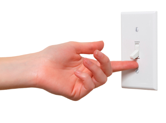
the Lighting is the most common use of the switch
Practical recommendations for the use of check boxes and radio buttons
Use the default appearance
The box is just a little box with a tick or a cross.
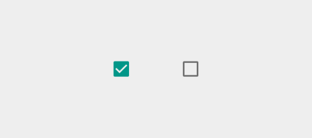
the Two-position check box: checked or not checked
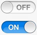
The switch should look like a normal toggle switch with two positions.

the Two-position switch: on or off
You need to provide clear and unambiguous user interaction with the control. Here can help a small animation – this is especially important for mobile applications where the UI needs to be handled.

the Switch iOS7/8
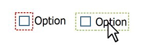
Try to keep a list of possible options is vertically. This rule applies to check boxes, and radio buttons. If you walk away from the horizontal placement is impossible, it is necessary to arrange elements with a large enough interval to avoid double interpretation that selects every check box. Below is an example with too closely spaced to each other elements.

the Difficult to understand what a radio button press to select the fourth option
the Current position of the switch
When designing the switches to avoid the uncertainty associated with the current state. As example, consider the switch from iOS 6 and look at it in the on position – the color of blue and displays the word ON (enabled).
the it is Not clear, included is a current status or proposed action
You can say for sure the switch is in the on position or does he only go into it if you perezvonite the slider? "Enabled" is state or action? It is not clear.
You do not need to enter users into believing; it is very important to distinguish between a condition and an action. Yes, you can use color to provide additional information to users, but it should be done so that the current view was seen clearly, as in the following example:

the font Color indicates the current position
The text labels of the check boxes use for positive confirmation that the user knew exactly what would happen if he put a mark. Avoid phrases like "never send me an e-mail message", which would mean that the user needs to check that something didn't happen.
The boxes should have labels with positive commands, not negative, "Not..."
Make the sign checkbox, the target area
All the boxes are accompanied by labels, but labels are not always clickable. The boxes are small, and the law Fitts on them, hard to get, a mouse, or a finger. In order to increase the area of the depression, allow customers to select desired option not only hit exactly in the box, but the label or related words.
the Allow user to make a selection by pressing not only the checkbox, but the label
Use the check boxes to modify only parameters, but not as control buttons
The main difference between a check box from the switch is that the check box is used to change the state, and the switch to enable or disable the action.
In the example below, the position of the switch allows you to say: wireless is enabled. In the case of checkbox, the user has to guess a WiFi enabled, or to enable it, tick.
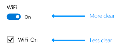
the enable/disable services and hardware components, such as WiFi, use radio buttons
Interaction check box is different from the interaction of the switch
You can make a condition that meets the checkbox had been changed immediately (as part of the send form, for example), but the action, which is responsible for the switch should be performed immediately.
Good practice user interaction is instantaneous change of the controlled parameter with a switch – not after clicking "Save" or go to the previous page. This is what we expected from this control in real life – we flip the switch and light turns on.
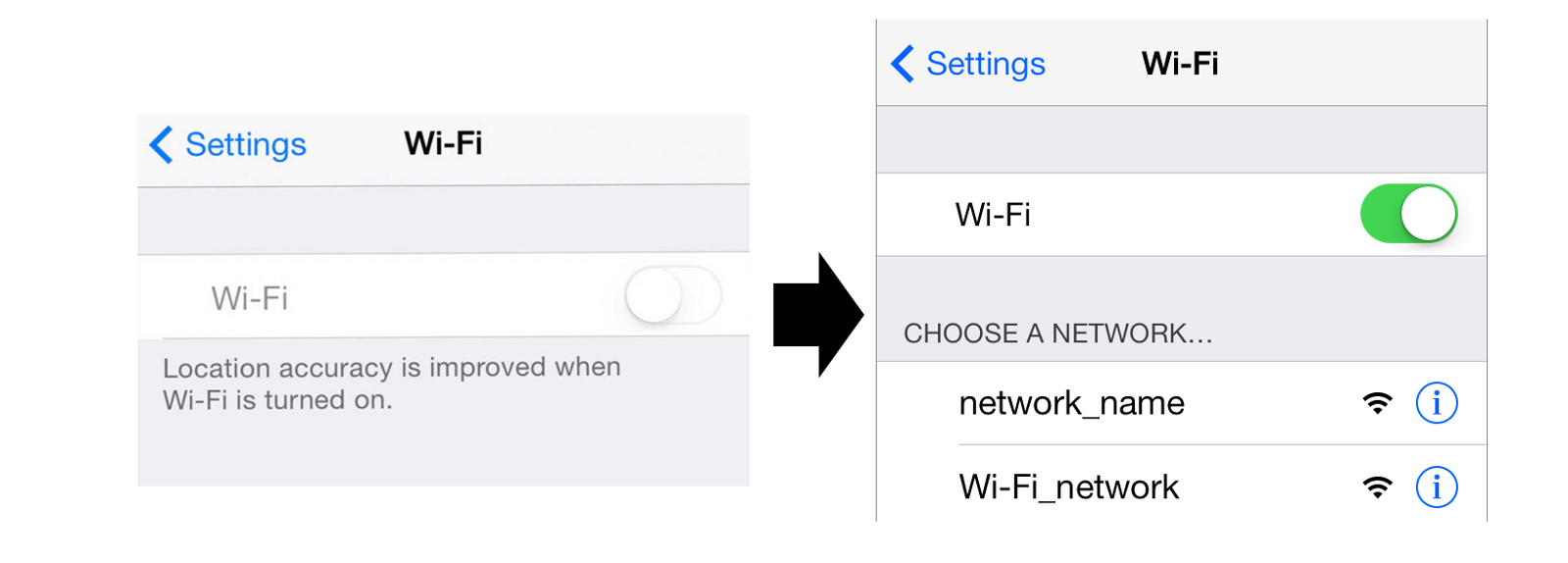
the Enable wifi in iOS
the Use the checkboxes when the input changes from the user are expected, additional steps
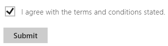
Use the checkboxes when the user should click the button "Send" or "Next" to save changes.
Opinion
In the interface design be consistent in the choice of its elements. Follow common standards; this allows users to get comfortable predictable handling. Otherwise, if you violate common standards, your user interface will be unpredictable, like at any moment can happen anything.


Комментарии
Отправить комментарий